
Another year has come and gone, and with a new one here comes just as many web design trends for 2016. During the last year, web design experienced a lot of changes as it moved away from being jam-packed with information. Instead, a more aesthetic approach was taken that revolved around simplicity and empty space. Many web sites are now looking similar to magazines, using large, high quality photos and typography to engage their readers visually before providing further content. These changes are continuing to thrive in the new year, and there are some key web design trends for 2016 you need to consider.
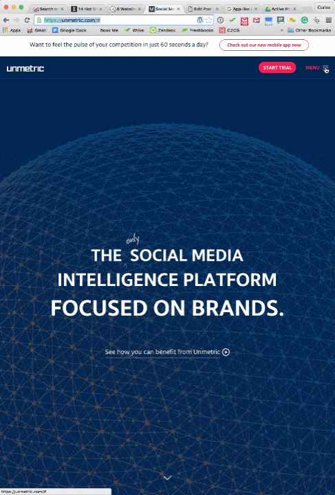
1. Minimalism
Forget the vibrant colors and information overload on your website because it is all about minimalism. Simplify your logos and fonts, and you will instantly clean up the look of your website as a whole. If something isn’t necessary, consider it clutter and get rid of it. Everything from footers, sidebars and borders are getting kicked to the curb. Keep things minimalist with one dominant color, and captivating and worthy content.

2. App-like Menu
This trend seems like a no-brainer, since mobile technology has continued to thrive over the years. Websites are now being designed with the mobile market in mind, and as such, it has changed the way content is organized and how readers can access it. The app-like menu web design trend goes hand-in-hand with the prior, as it takes on the minimalism approach by forbidding sticky menus and sidebars so there’s more room for content people actually want to see. Menus are often hidden at the top of the screen, and can be found with a simple click on an icon.
3. Interesting Typography
Although it was mentioned to use a more simple font, that doesn’t mean that your typography has to be boring – and it certainly shouldn’t be. An engaging font can instantly captivate your audience’s attention, without being too distracting. This is an important web design trend to consider, as the rest of the web site is fairly simple, you need something that sparks a bit of excitement!

4. Use of Stock Photos That Aren’t Obvious
Generic stock photos are so last year – finally! Captivating visual content is where it’s at for the web design trends for 2016. There are plenty of online resources that allow you to grab high quality photos in which you have the rights to do whatever you want with to it. This provides a more authentic and pleasing look to your website.

5. Single Page Design
Yet another trend that goes hand-in-hand with another. Mobile technology has once again, changed web design, as no one wants to click across multiple pages just to get to content they want to see. Websites are now taking on a single page design that allows your readers to view all content with a simple scroll. Depending on the complexity of your website, it may not sound plausible to have everything on a single page, but reducing the amount of pages on your website is certainly recommended. It’ll also be highly mobile-friendly, and with mobile Internet usage being consistently at an all-time high, you want this.
6. Parallax Scrolling
This is a new concept that allows websites to be more captivating without being over stimulating. Parallax scrolling consists of a three-dimensional illusion that will entice your audience and bring them further into your website and the content you offer. In other words, background images move at a slower rate than foreground images, which creates the illusion of depth.

7. The Evolution of Flat design
Flat design has been so popular recently that Google released a version called material design. Google’s version is similar to flat design as it takes on the same aesthetic approach that focuses on simplicity. However, it’s a bit more subtle as it uses gradients, shadowing and slight animation to add depth to the image. Flat design, on the other hand, includes simple illustrations to create minimalist two-dimensional content.

8. Line Icons
This trend is quickly becoming universal in web design. Line icons are a part of material design that is the other movement concluding the decline of skeuomorphism. Instead of having an icon that looks like the object it represents, they’re being created as simple lines and shapes to portray an action, thought or object, such as a magnifying glass representing a search function.
![]()
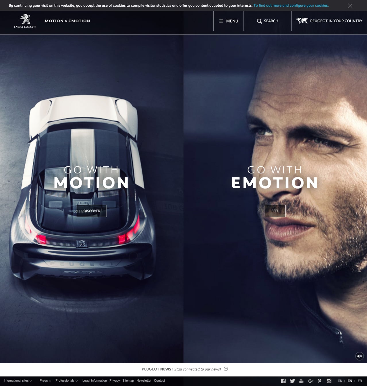
9. Vertical Split Layouts
Split screens are a huge web design trend for 2016 as well. Basically, it splits your layout vertically, which allows designers to present more content all at once, in a clean and simple way. This is also an excellent way to show equality between two things, such as the needs of a car and what the car provides, as opposed to only being able to show the most important thing at first with standard web layouts.

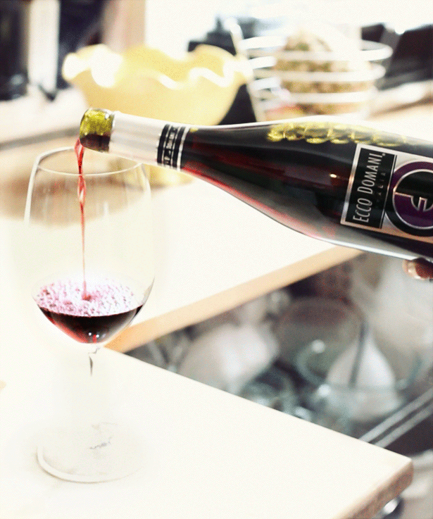
10. High-Quality Moving Images
If you can’t decide whether you want to have a photo or a video on your website, combine the two with a cinemagraph. It’s a moving image that says so much more than the thousands words that a photo is worth. It also uses up less bandwidth than a video and can truly liven up your entire site, while also adding visual content to long blog posts and keeping new visitors (and current ones) entertained longer than usual.
11. Interactive Storytelling
Captivate your audience with an interactive story right from the get-go by presenting an intriguing question. Since humans naturally love hearing stories and imaging themselves in the situation, this concept will make your reader curious, and furthermore, gets them clicking on one arrow to the next. Start off with a question, and don’t just provide the answer. Turn it into a story.

Needless to say, the web design trends for 2016 are certainly changing the game, and those who don’t adapt and are going to be left behind in a cloud of bounce rates.