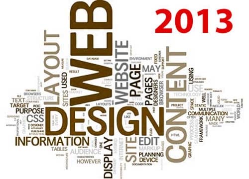
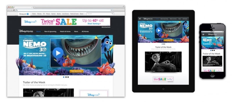
The entire trend pertaining to responsive web design has been continuously changing but has finally come to a conclusive idea of flat designs. These kind of layouts focus on matching all forms of digital media in order to support all devices such as; laptops, desktops, Smartphones, tablets, and of course, everything that will be released in the future.
The idea for responsive layouts throughout flat designs is to have a single set of codes that will work flawlessly on all devices. There is an assumption that responsive websites are set for mobile browsers only, but this isn’t the only purpose. It’s a basic canvas that becomes dynamic throughout the brilliant illustrations and graphics that are integrated into the layout. The CSS3 media queries provide developers with the ability to customize layouts, whether the site has limited or expanded screen capabilities.
Using this to your advantage means that you do not need to have a variety of different codes to coincide with the various means of technology. One code for all, and then you can customize them as needed.
2. Retina Support
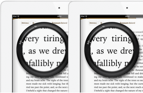
There has also been a significant increase in people who are building websites for retina devices which were first engineered by Apple with their iPhone 4.. Retina screens are now integrated into all of Apple’s latest products because these screens are twice as dense as other LCD screens. They have the same amount of pixels but digitally, twice as many pixels can be used to fill the same space providing a better visual. For pixel-enthusiastic web designers, this means that they have the ability to create two sets of images with the retina devices. First, they use the sample of the image to double the resolution and then save the standard image at half of the size. Since the larger images get scaled down to the standard resolution, the appearance is significantly clearer and much more crisp on retina screens.
A common tool for responsive web design utilizing retina support is retina.js. This JavaScript library automatically displays @2x retina versions of your image whenever it is being viewed from a retina device and is a handy resource to have, as opposed to have to recode everything within the media queries.
3. Fixed Header Bars
Within web design, there is the CSS position of having header bars “fixed”. This essentially means that the header remains at the top of the page, even as the visitor scrolls down. This allows easy access and navigation throughout your site and makes the experience for the viewer much more user-friendly and enjoyable which is crucial to encouraging viewers to come back and utilize your site. After all, no one enjoys having to scroll up just to go back to the home page.
The best thing about fixed headers is that they can work on almost any website, even the most basic or complex forms. As a result, social networking websites, blogs and even design studios and companies have started to take advantage of this feature that can be quickly added. There is no reason to not opt for a fixed header bar… Unless you simply want to have a web design that is more difficult for the user.
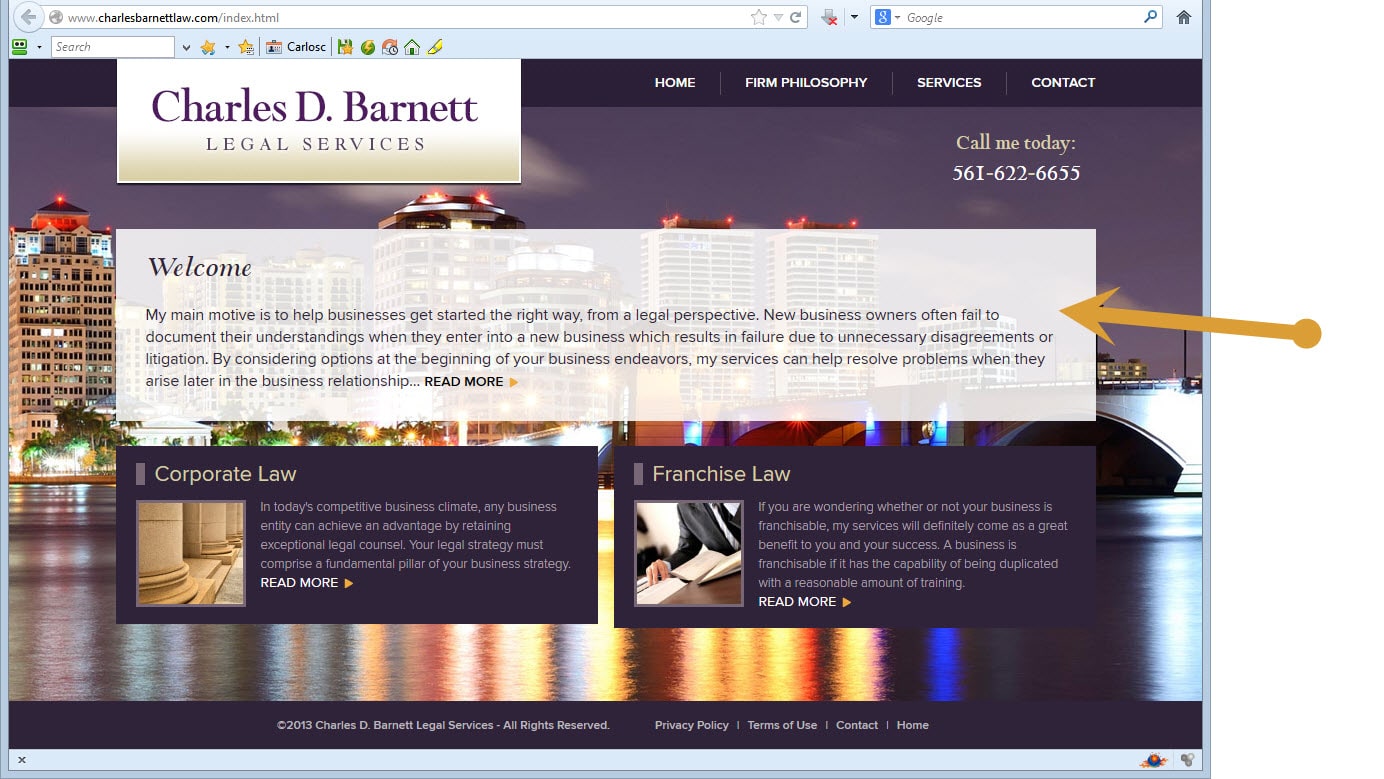
4. Large Photo Backgrounds
This is a trend that has definitely made a comeback. Large background photos were once seen as a poor choice of web design as they are often fairly too busy for the trend of flat designs. However, with the changes in technology, large photo backgrounds can now be integrated into the layout flawlessly while also ensuring that it flows naturally. It is a fabulous way to captivate the attention of your visitors but you must blend your large photo background into the entire layout so it doesn’t seem to harsh and busy, but rather fluent and pleasantly appealing. This is also a fabulous way to create brand recognition on your website.
5. CSS Transparency
With the new CSS3 properties, you can now play around with the opacity edits of your page, and this can come in handy for the previous trend of having large photo backgrounds as it will aid in the blending process. That’s also not to mention that this can be done without any photo editing program which had to be used previous. You can control the transparency on any modern web browser right within the CSS.
Another creative way to use the transparency edit options to your advantage is through rgba() color syntax. While in CSS, you can select specific colors suing Red, Green, Blue and Alpha-Transparency values. As a result, the syntax rgba(255,255,255,0.6) would make the color white at only 60% opacity. It makes the trend of flat designs much easier and personalized. Gone are the days of appearing generic
6. Infinite Scrolling
Although this isn’t a new trend of web design, it has really taken off this past year. Infinite scrolling is a loading technique for layouts that allow for new things to load as you continue to scroll. With this element, you don’t have to constantly click to see more as the next set of information automatically loads. It is extremely simple and emphasizes the user-friendly appeal of your website. This is used on all kinds of websites but typically works best on blogs, search result pages and websites that has constant updates or a continuous flow of content.
7. Deep Box Shadows
You have likely seen box shadows in a variety of modern web designs, and that is because the effects are absolutely stunning and rarely take away from the aesthetics of the site. Unless deep box shadows are overused, of course. Prior to the rise in this web design trend, integrated deep box shadows into the layout was rather difficult as it would take some kind of JavaScript or background created in Photoshop. Now, they can be quickly generated with some lines in CSS and voila!
This trend allows an extra dose of contrast and creativity to be accentuated within flat designs. Since a flat design is detailed minimally, taking advantage of simple features like deep box shadows emphasized the flat design without adding way too much that it affects the basic concept.
8. CSS3 Animations
With CSS3 transition properties and browser-specific prefixes, dynamic effects can now be created right in CSS, just like they were once done in Javascript. Web designs cannot implement animated effects on a page simply by changing the CC properties. Hover effects and form input fields are common uses of CSS3 animations.
A neat feature is that you can also use Codrops to set a time for the animations, and although this is a new feature, it is certain to hit it’s all-time peak for web designers as it works flawlessly with flat designs. You can add a spike of creativity within your basic layout without having to do any scripting.
9. Single-Page Web Design
This is a complex subject and is merely impossible to thoroughly cover in one category. However, single-page designed websites have been around since the beginning of the internet and has been consistently growing in popularity over the years. They’re basic which is on trend with flat designs, and straight to the point which is what the World Wide Web has made us accustom to – Convenience. You can also integrate the infinite scroll onto your website to easily make it a single-page web design.
With nearly two decades of career experience in IT and online commerce, West Palm Beach-based Carlos Caneja currently serves as President of britecode. Since its founding in 2010, the company offers customized, cutting-edge strategies to help clients achieve their goals—including branding, web design & development, SEO and online marketing.
His company’s sophisticated strategies and unique understanding of client goals is driven by a one-on-one customer service-driven mandate, utilizing approaches that are fit best for every individual client. Carlos’ mantra for britecode: “Open dialogue is a must when working with our clients, as positive input helps us better understand what they want from each project. It’s how we’re able to consistently deliver results that amaze and impress our clients.”
He previously worked for 11 years as COO with Applied Innovations, which provides a wide range of enterprise-grade Windows Hosting services to the online marketplace.


