With the very first responsive web design being introduced in 2010, it’s safe to say that this style of websites has certainly taken off in popularity. Apple launched the highly sought after mobile tablet devices called iPads which completely changed the way that we use the web today, and the way in which we communicate with one another. Things have definitely changed within the technology industry, and since the big peak of success with responsive design, it has only become much more widespread. Despite it’s popularity, many people actually have no idea what this term means, and focus solely on having a website that works properly. They don’t necessarily place importance on hyperlinks that can link to other pages with more specific information, or even on coding and imagery that takes too long to download. People just want to design a fast loading page that is easy to use, but very rarely do they know that they can still get that and so much more with a responsive design. Let’s take a look at your web design and see how we can improve it’s responsive design.
Ranking with a Mobile Responsiveness
When it comes to investing time and design into your website, you always need to keep Google’s guidelines for ranking close in mind, and your mobile responsiveness is a ranking component. Only recently, Google announced that whether or not your website is user-friendly when viewed on mobile devices will be a ranking factor. So, as of April 21st, if you haven’t been placing importance, you may start seeing your Google search engine ranking taking a plunge which is never a good thing. This update has been nicknamed Mobilegeddon, and it’s so vital to your success that it has made news all over the world. To get you on the the ride, you need to first test the mobile responsiveness of your website, and find out what you can do to enhance it.
What Is a Good Responsive Design?
One of the biggest benefits of having a responsive design is that your website will automatically adapt to all different screen sizes and resolutions. Simply put, regardless of the device that you’re using, responsive design will ensure that you have optimal usability with all the functions working efficiently and properly – or in other words, the same, on each device. So, for example your menu bar or social media sharing buttons you see when using a desktop won’t disappear when viewed from a mobile device, tablet or something else.
You Need a Responsive Website
Everyone benefits from having a responsive design website; both the site owner and the viewers. If you don’t currently pay close attention to the information provided in Google Analytics, there’s no better time to start doing the opposite because with the data, you can find out how many people are visiting your site from specific devices, such as a mobile device or tablet, and you can also see how long they spend on your site. If the majority of mobile device users aren’t staying longer than a couple seconds or a minute, you may have just found the problem – you don’t have a responsive design website. Some Analytic settings also allow you to see how many of those users go on to purchase something from the site or join your mailing list. This is all important information to pay attention to at all times, but it could really be all you need to convince you that you need a responsive website.
Check your Google Analytics by going to the site, click on the site you wish to review, then select Audience > Mobile > Overview.
Somethings to check out include; Bounce Rate, Pages/Session, Avg Session Duration and Goal Conversion Rate. If your numbers are much lower than those associated with desktop usage, there’s one way to fix that, and it’s with a responsive design website because the data is telling you that people viewing your site on tablet and mobile devices are not receiving the best experience.
It’s Time To Test Your Site for Mobile Responsiveness
If you are unsure as to whether or not your website is mobile responsive, there are some tests and tools that you can do online that will see how your website runs and appears on mobile devices. However, let’s first focus on the simplest of tests to see if responsive design is definitely the issue. If you’re on a desktop, load your site that you want to test and make the browser narrower by dragging the bottom corner. If your website is responsive, the elements of the page will adjust so that they are still there. You just may have to scroll to see them. If you’re on a mobile device, go to the site that you want to test and see how it loads. If it takes a long time or if it looks exactly the same way as your desktop version (not shrunken down so you will likely have to do copious amounts of scrolling to see the entire thing), then you don’t have a responsive design. Everything should collapse to minimize the scrolling from left to right, allowing you to see everything as you scroll down.
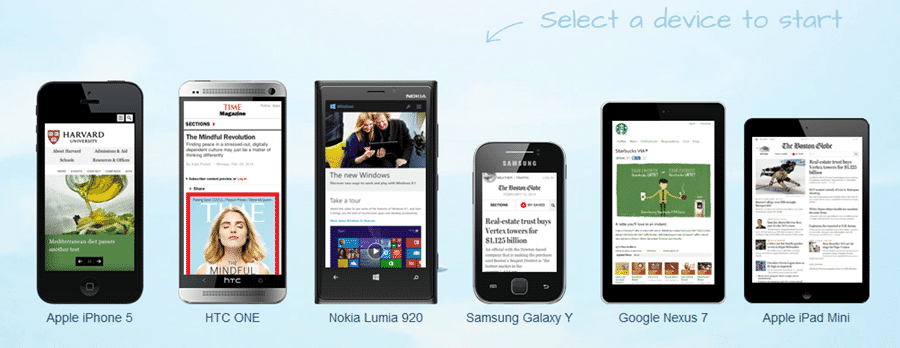
Testing Multiple Devices With Online Emulators
Running simple tests is an excellent option to see if your site is responsive or not, but with the massive amounts of tech devices out there, from iPads to Google Tablets, Androids, iPhones and so much more, you want to be sure that your site appears properly across all of them. Here are some websites to use to test the performance of your website.
With this website, you can test your site with 6 popular mobile devices, such as the iPhone 5, and Google Nexus. All you have to do is click on the device you want to test, enter the URL of your website and within a couple of seconds, you’ll have your results with page links and other data, allowing you to browse the site via the emulator.
This emulator focuses mainly on Apple products, but does include some Android machines. The benefit of this website is that you don’t have to test each device individually. You just enter the URL, and scroll through the data provided.
The process is similar with this website; enter the URL and receive the results. However, you don’t have to scroll as the data for the generic devices are right at the top and you can click each to see more specific information and use the site as normal.
Of course, Google offers a testing tool as well and since Google’s regulations basically rule the internet, you can’t go wrong with this. It’s called Google Mobile Testing Tool and the process is simple to follow.
What do I do Next?
If you site shows that works across all devices, you’re good and there’s no need for you to do anything. However, if your site doesn’t work, there are a variety of options that you have. The first is to convert your website to a responsive one which can be very hard or very simple to do. So, definitely do your research and find a responsive theme. You can also opt for a mobile theme. Although, it will make your website responsive on mobile devices as well, you still aren’t considering tablets and other viewing devices out there. You can also redesign your site to have a mobile responsive theme from scratch. Although timely and not always the most affordable option, you can ultimately achieve the best results with this option.
Once Your Website is Responsive
So, you have selected and option and made your website responsive. Now, you have to test it. Some things to pay attention to is whether your website is easy for users to use, is the content easy to read and is it easy for the users to find and follow your Calls to Action? Give your site a detailed once-over as if you were an ordinary user yourself. Go through different pages and elements and fix any problems that you come across.
Google making the changes to place emphasis on websites that are responsive is truly a win-win for everyone. In fact, some even say that it is long overdue and since it is beneficial for everyone – from the designers and theme builders, to the website owners and users and everyone in between. With so many websites not being responsive, jumping on this trend can boost your ratings in Google and send you record-hitting traffic.
With nearly two decades of career experience in IT and online commerce, West Palm Beach-based Carlos Caneja currently serves as President of britecode. Since its founding in 2010, the company offers customized, cutting-edge strategies to help clients achieve their goals—including branding, web design & development, SEO and online marketing.
His company’s sophisticated strategies and unique understanding of client goals is driven by a one-on-one customer service-driven mandate, utilizing approaches that are fit best for every individual client. Carlos’ mantra for britecode: “Open dialogue is a must when working with our clients, as positive input helps us better understand what they want from each project. It’s how we’re able to consistently deliver results that amaze and impress our clients.”
He previously worked for 11 years as COO with Applied Innovations, which provides a wide range of enterprise-grade Windows Hosting services to the online marketplace.


