

Traffic is great, but it isn’t doing much for you if your store’s visitors aren’t converting into paying customers. While there are many major changes that can be done to enhance your sales, such as the store’s design, coupons and new copywriting, it is just as important to never overlook the simple things that can certainly give you the boost in sales that you are looking for. This is a vital option for those working within a strict marketing budget, and simple elements within your store’s navigation have an incredible amount of potential, and can have an even larger impact on your sales. Consider making these following changes that are easy and affordable to implement into your store’s design that can significantly increase your sales.
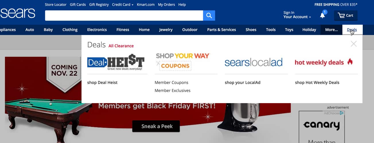
Showcase Top-Level Categories
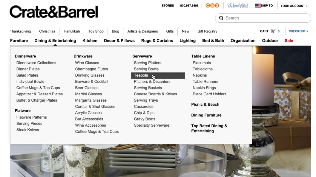
Sometimes people go to stores without knowing exactly what product they’re looking for, and they may be seeking some inspiration or are visiting your site after being recommended by a friend instead. Highlighting top-level categories within your store can encourage those less decisive customers to make a purchase. Showcasing these broad categories of popular items on your site motivates them and basically shows them exactly what they want even if they didn’t know previously. For example, if you sell furniture, create sections in your menu that are specific to a room such as ‘bedroom furniture’ or ‘living room furniture’. However, when doing so, you must be sure to create the actual corresponding category landing pages as some stores do not and recent studies conducted by Smashing Magazine’s eCommerce showed that this was one of the biggest issues customers experienced. Research also showed that many subjects expect top-level categories to be clickable so that they could then land on the corresponding page of products. During the research, many top-level categories couldn’t be explored, which resulted in customer confusion and frustration. On the contrary, some of these top-level categories were clickable but directed the customer to a category that wasn’t the one shown in the menu. This also caused significant frustration amongst the customers.
Additionally, while it is crucial to offer broad product categories, subcategories should also be offered to enhance the customer’s navigation experience. For example, someone unsure of the camera type that they want will want to select the “Digital Cameras” category (a broad product category) as opposed to specifying a camera type (subcategory) that a more decisive shopper will. So in order to provide for your past, present and future customers, add broader categories as well as subcategories, and ensure that they all link to the correct location.
Now, you may feel as if the option of subcategories doesn’t apply to your store due to limited products available, but in these cases, create browsing categories by size, color or material. By filtering product selection with categories, you are furthering the navigation process on your store.
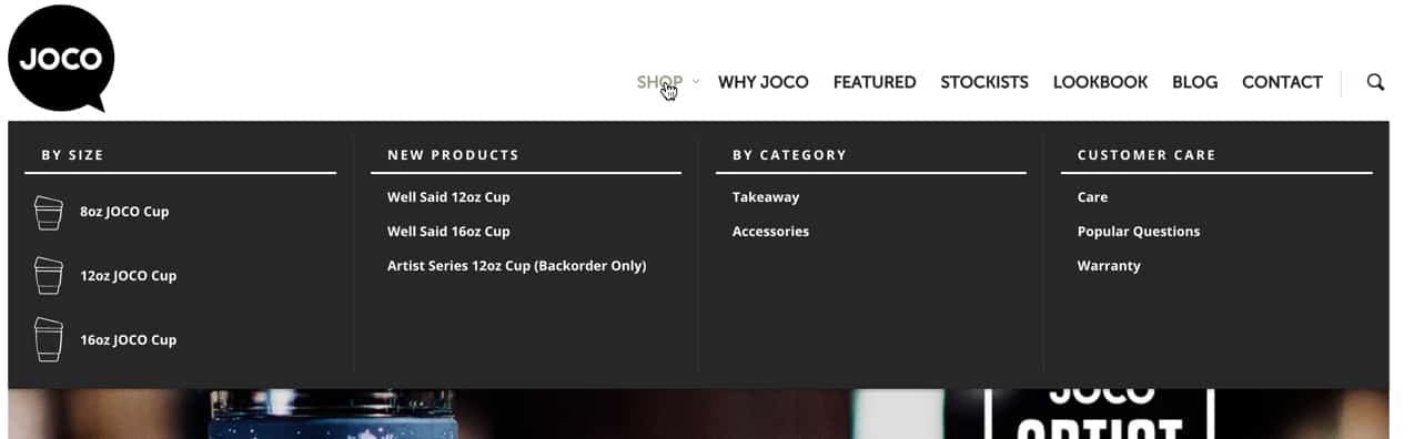
A prime example of a store offering limit products is the JOCO Cups Store. They only sell glass coffee cups, so their site navigation offers categories by size and the type of product (accessories or cups).
It’s all about creating a convenient path for your customers that browse your store.
Repeat Links to Subcategories
This tip used to convert customers into sales should only be used when appropriate. If your store is large with a wide range of products, your customers may take different paths to end up on the same page. For example, a desk can be found by clicking on “office furniture” or “living room furniture” categories. As a result, if this applies to your store, you should be offering multiple links to the same subcategory to ensure that your customers can easily navigate through your store to find what they want. Best Buy does this by offering printer ink in both the “Computers” category as well as the “Office” category. However, you do not have to create two separate landing pages with different URLS for each subcategory. You just need to take advantage of a multi-link scenario by creating a subcategory under a main category that fits best.
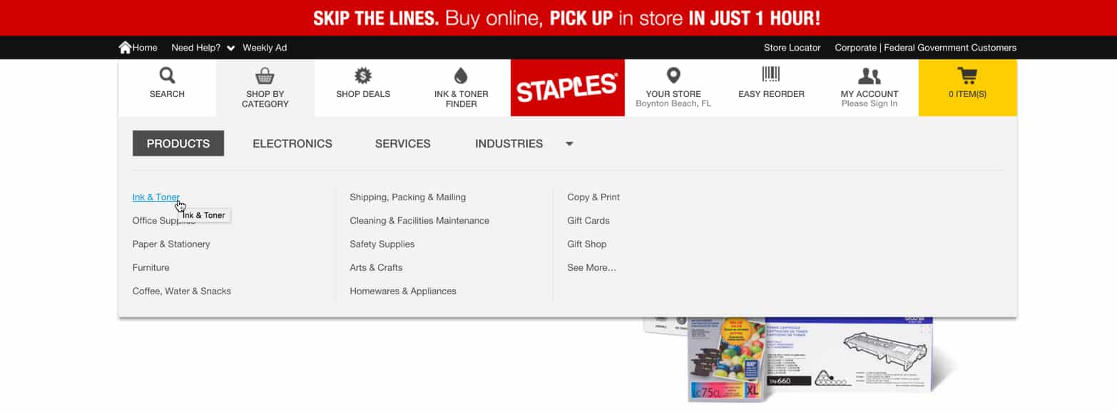
For example, Staples may have the printer ink under “Ink & Toner Finder” and then added a custom link so it also appears under “Products”.
Offer Additional Filtering Once a Category is Selected
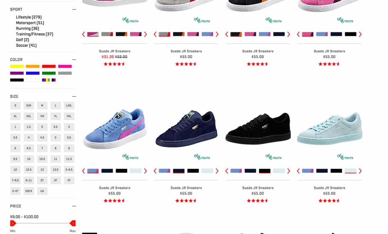
Once your visitors have selected a category to browse, offer them additional filtering to further help them navigate to the item that they want while also encouraging them to make a purchase – something no eCommerce store should ever be without. By filtering, you are allowing your customer to only see what they want, so it may be shoes in size 7, prices sorted low to high, color, age range, style, brand etc. The faster they see exactly what appeals to them, the faster they can add your products to the shopping cart.
To increase conversations with the navigation of your site, you should also consider adding visible links that send your customer straight to a desirable page, such as sales that you currently have, clearance items or even brand new items or limited editions. Your customers will feel more enticed to finalize a purchase when they feel like they’re getting a bargain, or something that no one else has. So analyze your analytics to see if you have more savvy shoppers or more customers that want to get something exclusive/limited. The trick to this tip is to make the links visible.
So, what do all these tips mean? It’s all about making your navigation clear and simple, and highlighting and correctly linking to landing pages that are truly going to attract your visitors. With too many menus and options, things can quickly become overwhelming for your customers, so try filtering to reduce the number of top-level categories and subcategories that you use. You should also always provide a search option and leave the footer of your page for minimal links, such as a contact form, social media links and your privacy policy. Be sure to run a test before finalizing any changes that you make to your site to ensure that it’s done properly and more importantly, that your customers like it. If the new design isn’t ideal, you can resort back to the original and go back to the drawing board. Lastly, as a rule of thumb, make it a habit to test your navigation periodically to ensure that all the links are working properly and linking to the correct places, and to also make sure that you haven’t forgotten to remove, rename, add or update something else on your website. Navigation of your website plays a huge role in how many visitors become paying customers, so make sure your layout motivates customers to convert.
With that said, while these simple tips are extremely important and should never be overlooked, its just as important to implement them with other marketing practices that will further reduce the bounces on your site while also increasing the curious shoppers making a purchase.