Anniversaries of anyone – or anything – can be an exciting time! It’s a great opportunity to reminisce about the “way things were,” but with the anniversary of the JPEG turning 25, things are a little different. The JPEG has been a core standard for image compression, staying “current” […]
Another year has come and gone, and with a new one here comes just as many web design trends for 2016. During the last year, web design experienced a lot of changes as it moved away from being jam-packed with information. Instead, a more aesthetic approach was taken that […]
Google has taught you a lot, and the truth is that if you aren’t staying up to date with their information, you’re missing out on the most optimal experience that can be provided from a search engine. Since there is a […]
Just because you have a visually appealing, SEO-rich website doesn’t always mean that you’re seen as high-ranking worthiness in Google’s eye. Many people forget about one of the important ranking factors out there; site speed, and although it isn’t as vital as some of the other 200 plus ranking […]
The entire trend pertaining to responsive web design has been continuously changing but has finally come to a conclusive idea of flat designs. These kind of layouts focus on matching all forms of digital media in order to support all devices such as; laptops, desktops, Smartphones, tablets, […]
britecode Design | britecode
Design
Anniversaries of anyone – or anything – can be an exciting time! It’s a great opportunity to reminisce about the “way things were,” but with the anniversary of the JPEG turning 25, things are a little different. The JPEG has been a core standard for image compression, staying “current” for decades while other pieces of technology and software continue to go through iteration after iteration seemingly every few months.
New Horizon for Image Compression
As the JPEG turns 25, we are now beginning to hear about faster and more efficient image compression formats being developed that could potentially cut photo file sizes by 60 percent or more. The group responsible for the JPEG, the Joint Photographic Experts Group, has been developing the successor of the JPEG called JPEG XL.
With a more effective and more efficient compression format, users of JPEG XL would be able to store more photos on their mobile devices and personal computers, save more on their bandwidth usage by using less data to download what is essentially the same image, and have the ability to store even more files on their cloud storage.
The Race for the New Standard
JPEG XL isn’t the only image format that is being developed, which means that it’s a race for a handful of different “groups” to create the new standard for image formats and compression. Below are just a few of the image and video formats being developed in the hopes of creating the “new standard” for images/video.
AVIF (AV1 Image Format), developed by Mozilla, Google, Netflix, and more.
MIAF (Multi-Image Application Format), which is a simpler version of HEIF.
HEIF (High-Efficiency Image Format), which is currently supported by Apple and Microsoft.
As a user, all of these new “standards” will mean more effective image compression when downloading and uploading images. These image formats, from JPEG to the JPEG XL and all of its “competitors,” drastically reduce the data storage size of the image without losing a lot of the quality of the image. These compression formats pull out less-necessary data from the file while retaining the heart of the image.
The challenge with having so many different image formats being developed and supported by different, large entities is that if there is no one true “standard” for the “new image format,” then the market (including both the users of the formats as well as the supporters/developers of the formats) will be severely divided. When a market is divided like that, it becomes challenging for creators of hardware (such as phones and computers) and software (such as the apps and websites that you use) to focus on which formats to fully support.
If the image format isn’t chosen as “the” image format for the majority of the market, then it’s harder for it to get adopted and used by everyone, and that could mean that the general user base of the public and developers of hardware/software will continue to use older formats like the 25-year-old JPEG.
Regardless of what happens, it will be interesting watching to see what happens and which image format will come out on top – or if the JPEG will continue to hold its position close to the top until a new successor is chosen by the entire market.
Another year has come and gone, and with a new one here comes just as many web design trends for 2016. During the last year, web design experienced a lot of changes as it moved away from being jam-packed with information. Instead, a more aesthetic approach was taken that revolved around simplicity and empty space. Many web sites are now looking similar to magazines, using large, high quality photos and typography to engage their readers visually before providing further content. These changes are continuing to thrive in the new year, and there are some key web design trends for 2016 you need to consider.
1. Minimalism
Forget the vibrant colors and information overload on your website because it is all about minimalism. Simplify your logos and fonts, and you will instantly clean up the look of your website as a whole. If something isn’t necessary, consider it clutter and get rid of it. Everything from footers, sidebars and borders are getting kicked to the curb. Keep things minimalist with one dominant color, and captivating and worthy content.
2. App-like Menu
This trend seems like a no-brainer, since mobile technology has continued to thrive over the years. Websites are now being designed with the mobile market in mind, and as such, it has changed the way content is organized and how readers can access it. The app-like menu web design trend goes hand-in-hand with the prior, as it takes on the minimalism approach by forbidding sticky menus and sidebars so there’s more room for content people actually want to see. Menus are often hidden at the top of the screen, and can be found with a simple click on an icon.
3. Interesting Typography
Although it was mentioned to use a more simple font, that doesn’t mean that your typography has to be boring – and it certainly shouldn’t be. An engaging font can instantly captivate your audience’s attention, without being too distracting. This is an important web design trend to consider, as the rest of the web site is fairly simple, you need something that sparks a bit of excitement!
4. Use of Stock Photos That Aren’t Obvious
Generic stock photos are so last year – finally! Captivating visual content is where it’s at for the web design trends for 2016. There are plenty of online resources that allow you to grab high quality photos in which you have the rights to do whatever you want with to it. This provides a more authentic and pleasing look to your website.
5. Single Page Design
Yet another trend that goes hand-in-hand with another. Mobile technology has once again, changed web design, as no one wants to click across multiple pages just to get to content they want to see. Websites are now taking on a single page design that allows your readers to view all content with a simple scroll. Depending on the complexity of your website, it may not sound plausible to have everything on a single page, but reducing the amount of pages on your website is certainly recommended. It’ll also be highly mobile-friendly, and with mobile Internet usage being consistently at an all-time high, you want this.
6. Parallax Scrolling
This is a new concept that allows websites to be more captivating without being over stimulating. Parallax scrolling consists of a three-dimensional illusion that will entice your audience and bring them further into your website and the content you offer. In other words, background images move at a slower rate than foreground images, which creates the illusion of depth.
7. The Evolution of Flat design
Flat design has been so popular recently that Google released a version called material design. Google’s version is similar to flat design as it takes on the same aesthetic approach that focuses on simplicity. However, it’s a bit more subtle as it uses gradients, shadowing and slight animation to add depth to the image. Flat design, on the other hand, includes simple illustrations to create minimalist two-dimensional content.
8. Line Icons
This trend is quickly becoming universal in web design. Line icons are a part of material design that is the other movement concluding the decline of skeuomorphism. Instead of having an icon that looks like the object it represents, they’re being created as simple lines and shapes to portray an action, thought or object, such as a magnifying glass representing a search function.
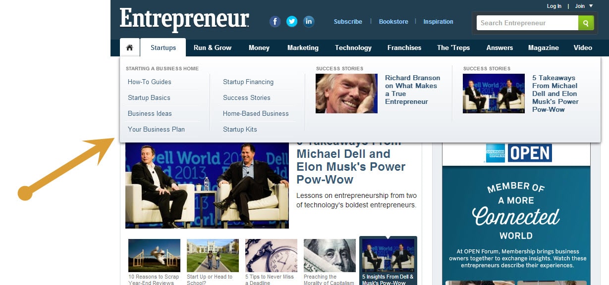
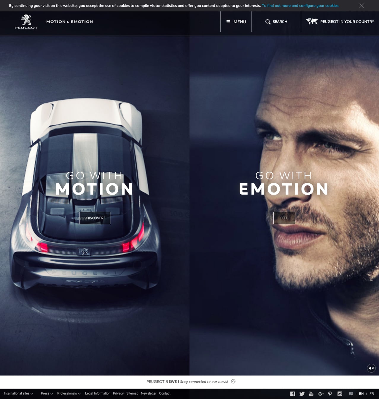
9. Vertical Split Layouts
Split screens are a huge web design trend for 2016 as well. Basically, it splits your layout vertically, which allows designers to present more content all at once, in a clean and simple way. This is also an excellent way to show equality between two things, such as the needs of a car and what the car provides, as opposed to only being able to show the most important thing at first with standard web layouts.
10. High-Quality Moving Images
If you can’t decide whether you want to have a photo or a video on your website, combine the two with a cinemagraph. It’s a moving image that says so much more than the thousands words that a photo is worth. It also uses up less bandwidth than a video and can truly liven up your entire site, while also adding visual content to long blog posts and keeping new visitors (and current ones) entertained longer than usual.
11. Interactive Storytelling
Captivate your audience with an interactive story right from the get-go by presenting an intriguing question. Since humans naturally love hearing stories and imaging themselves in the situation, this concept will make your reader curious, and furthermore, gets them clicking on one arrow to the next. Start off with a question, and don’t just provide the answer. Turn it into a story.
Needless to say, the web design trends for 2016 are certainly changing the game, and those who don’t adapt and are going to be left behind in a cloud of bounce rates.
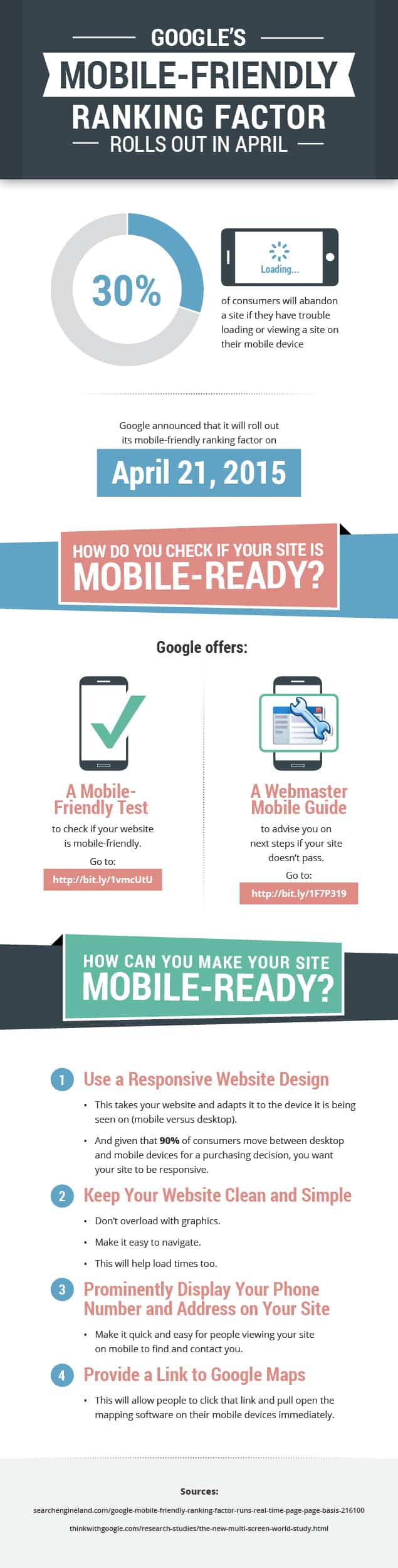
Google has taught you a lot, and the truth is that if you aren’t staying up to date with their information, you’re missing out on the most optimal experience that can be provided from a search engine. Since there is a significant increase in people using their mobile devices to access webpages, chances are that you too, pull out your phone to find the latest information. You’ve probably also been frustrated with not being able to find relevant and/or timely results because not all webpages are mobile-friendly. What’s worse is when you can’t even find the information you’re searching for. Google has launched two new changes that will help users find more mobile-friendly webpages, and whether you’re the one searching for some content, or a company providing it, these important changes are definitely worth listening to.
Change #1: Mobile Friendly Ranking
Google has a lot to do with the ranking within search engine results. As of April 21, they will be placing importance on how mobile-friendly a website is. As a result, businesses that provide a webpage that is up to date with mobile-use will have a better SEO ranking, and users will then be able to find such companies that provide relevant content. Google also provides a guide to help businesses provide a mobile-friendly webpage. Their webmaster tool also offers you the option to test just how mobile friendly your site is.
Change #2: App Content Ranking
Google will now be using information from indexed apps to help determine the ranking for signed-in users that have the application installed. This change is effective right now. What this means for you is that Google will be able to find app content that is relevant to what the user is searching for. Again, giving businesses a better ranking in the search engines and providing users with more relevant information from their searches. If App indexing is all new to you, then it is highly recommended to check out Google’s easy-to-follow guide that will teach you how to apply App indexing.
Google is constantly changing things up, but it’s always for the better of businesses and the users of its search engine. This leaves those search results (and company webpages) that don’t place importance on their online marketing strategy and customers’ experience in the dust… Or at the very least, further in the search engine results.
Just because you have a visually appealing, SEO-rich website doesn’t always mean that you’re seen as high-ranking worthiness in Google’s eye. Many people forget about one of the important ranking factors out there; site speed, and although it isn’t as vital as some of the other 200 plus ranking factors, this element of your webpage shouldn’t be ignored. If you’re not sure where your website’s speed is, you can utilize Google’s free tools that allow you to test your pages for both desktop and mobile use. More importantly, it’ll provide you with suggestions as to how to enhance your website’s performance. Here is everything you need to know, whether you’re starting from the bottom up or already have a developed webpage and need to optimize it’s speed.
Performance Reflects Your Stats and Ranking
Your sites overall performance is a key factor in how Google ranks your website. If your landing page isn’t working effectively and quickly, your ranking is jeopardized, but what most people don’t know is that your Ad Rank and advertising costs are also going to be affected. With a slow website, people are likely to click that “back” button that gets them away from your website, and Google’s sees this as a poor user experience, which hurts your conversion rate.
Stats That Makes Sense
What does this all mean? The following stats should will show you just how important your user’s experience is, not only in the eyes of Google but also in the eyes of your success.
47% of consumers expect a webpage to load within 2 seconds or less.
40% of consumers will leave a website if it takes longer than 3 seconds to load.
People expect webpages to load just as fast on their mobile devices as they do on a desktop.
Estimates show that even a 1 second delay in site speed can result in a 7% lower conversion.
Suggestions for Site’s Speed
There are a variety of suggestions you should work through to ensure that your website’s speed is working to its fastest possibility. These factors are as basic as selecting high quality website hosting, as complex as website design and everything in between like modifying your caching system. First, take advantage of Google’s tools; Pingdom and Pagespeed Insights to see where your site’s speed is at, and then work through these suggestions to enhance it.
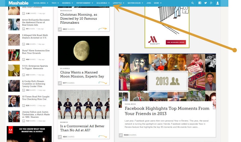
Check the Charts
Google offers many charts that show you vital information pertaining to the performance and success of your website. One of them combines the two and will show you the relationship between your slow website and user experience. Sometime as little as a large file can truly slow down the entire website significantly which decreases the user experience, but you’ll also be able to see how many of them wait to receive the content you provide.
Website Design
Your website design can also play a huge part is slowing things down. While designing your very own website from ground up is a proud moment, investing in a web designer that knows how to create an incredible website and simplified coding that is timely. They’ll also be able to inform you if your web pages are just too busy, and as such, will be able to simplify that as well.
File Sizes
To instantly decrease the amount of time that is spent loading your website, try to reduce the size of images. This is actually a fairly easy process and there are many tools out there to get your images smaller without jeopardizing the appearance of them, or sacrificing your website’s visual appearance as a whole.
High Quality Hosting
While you don’t have to purchase the most expensive hosting service out there, the cheapest really isn’t going to cut it today. You get what you pay for, so always choose hosting from a reputable company, and more importantly, one that is appropriate for the type of website and technology you are using.
These changes could be very simple for you to implement, or timely or costly depending on how severe your site’s speed is suffering, and although this is only a minor ranking factor within Google’s ranking regime, it shouldn’t be overlooked. Your user experience is a huge component to your success, and if everyone is clicking off of your website within seconds because it won’t load, your webpage really isn’t serving its purpose anyway, right?
1. Responsive Layouts
The entire trend pertaining to responsive web design has been continuously changing but has finally come to a conclusive idea of flat designs. These kind of layouts focus on matching all forms of digital media in order to support all devices such as; laptops, desktops, Smartphones, tablets, and of course, everything that will be released in the future.
The idea for responsive layouts throughout flat designs is to have a single set of codes that will work flawlessly on all devices. There is an assumption that responsive websites are set for mobile browsers only, but this isn’t the only purpose. It’s a basic canvas that becomes dynamic throughout the brilliant illustrations and graphics that are integrated into the layout. The CSS3 media queries provide developers with the ability to customize layouts, whether the site has limited or expanded screen capabilities.
Using this to your advantage means that you do not need to have a variety of different codes to coincide with the various means of technology. One code for all, and then you can customize them as needed.
2. Retina Support
There has also been a significant increase in people who are building websites for retina devices which were first engineered by Apple with their iPhone 4.. Retina screens are now integrated into all of Apple’s latest products because these screens are twice as dense as other LCD screens. They have the same amount of pixels but digitally, twice as many pixels can be used to fill the same space providing a better visual. For pixel-enthusiastic web designers, this means that they have the ability to create two sets of images with the retina devices. First, they use the sample of the image to double the resolution and then save the standard image at half of the size. Since the larger images get scaled down to the standard resolution, the appearance is significantly clearer and much more crisp on retina screens.
A common tool for responsive web design utilizing retina support is retina.js. This JavaScript library automatically displays @2x retina versions of your image whenever it is being viewed from a retina device and is a handy resource to have, as opposed to have to recode everything within the media queries.
3. Fixed Header Bars
Within web design, there is the CSS position of having header bars “fixed”. This essentially means that the header remains at the top of the page, even as the visitor scrolls down. This allows easy access and navigation throughout your site and makes the experience for the viewer much more user-friendly and enjoyable which is crucial to encouraging viewers to come back and utilize your site. After all, no one enjoys having to scroll up just to go back to the home page.
The best thing about fixed headers is that they can work on almost any website, even the most basic or complex forms. As a result, social networking websites, blogs and even design studios and companies have started to take advantage of this feature that can be quickly added. There is no reason to not opt for a fixed header bar… Unless you simply want to have a web design that is more difficult for the user.
4. Large Photo Backgrounds
This is a trend that has definitely made a comeback. Large background photos were once seen as a poor choice of web design as they are often fairly too busy for the trend of flat designs. However, with the changes in technology, large photo backgrounds can now be integrated into the layout flawlessly while also ensuring that it flows naturally. It is a fabulous way to captivate the attention of your visitors but you must blend your large photo background into the entire layout so it doesn’t seem to harsh and busy, but rather fluent and pleasantly appealing. This is also a fabulous way to create brand recognition on your website.
5. CSS Transparency
With the new CSS3 properties, you can now play around with the opacity edits of your page, and this can come in handy for the previous trend of having large photo backgrounds as it will aid in the blending process. That’s also not to mention that this can be done without any photo editing program which had to be used previous. You can control the transparency on any modern web browser right within the CSS.
Another creative way to use the transparency edit options to your advantage is through rgba() color syntax. While in CSS, you can select specific colors suing Red, Green, Blue and Alpha-Transparency values. As a result, the syntax rgba(255,255,255,0.6) would make the color white at only 60% opacity. It makes the trend of flat designs much easier and personalized. Gone are the days of appearing generic
6. Infinite Scrolling
Although this isn’t a new trend of web design, it has really taken off this past year. Infinite scrolling is a loading technique for layouts that allow for new things to load as you continue to scroll. With this element, you don’t have to constantly click to see more as the next set of information automatically loads. It is extremely simple and emphasizes the user-friendly appeal of your website. This is used on all kinds of websites but typically works best on blogs, search result pages and websites that has constant updates or a continuous flow of content.
7. Deep Box Shadows
You have likely seen box shadows in a variety of modern web designs, and that is because the effects are absolutely stunning and rarely take away from the aesthetics of the site. Unless deep box shadows are overused, of course. Prior to the rise in this web design trend, integrated deep box shadows into the layout was rather difficult as it would take some kind of JavaScript or background created in Photoshop. Now, they can be quickly generated with some lines in CSS and voila!
This trend allows an extra dose of contrast and creativity to be accentuated within flat designs. Since a flat design is detailed minimally, taking advantage of simple features like deep box shadows emphasized the flat design without adding way too much that it affects the basic concept.
8. CSS3 Animations
With CSS3 transition properties and browser-specific prefixes, dynamic effects can now be created right in CSS, just like they were once done in Javascript. Web designs cannot implement animated effects on a page simply by changing the CC properties. Hover effects and form input fields are common uses of CSS3 animations.
A neat feature is that you can also use Codrops to set a time for the animations, and although this is a new feature, it is certain to hit it’s all-time peak for web designers as it works flawlessly with flat designs. You can add a spike of creativity within your basic layout without having to do any scripting.
9. Single-Page Web Design
This is a complex subject and is merely impossible to thoroughly cover in one category. However, single-page designed websites have been around since the beginning of the internet and has been consistently growing in popularity over the years. They’re basic which is on trend with flat designs, and straight to the point which is what the World Wide Web has made us accustom to – Convenience. You can also integrate the infinite scroll onto your website to easily make it a single-page web design.


 Gallery
 Gallery

 Gallery


